 |
It's a Wonderful Line: Data Analysis Using Graphs |
 |
Conservation Laws - Data Analysis Using Graphs - Histograms - Units or Vectors in Particle Physics
Example 1
-
Example 2
-
Example 3
-
Example 4
-
Problems
Example 4: It's a wonderful half-life
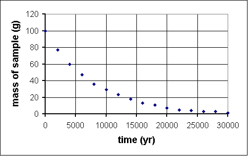
Last year, deep within the Soudan mine, QuarkNet teachers began a long-term experiment to measure the amount of carbon-14 remaining in an initial 100-gram sample at 2000-year intervals. The experiment will be complete in the year 32001. Fortunately, a method for sending information backwards in time will be discovered in the year 29998, so, although the experiment is far from over, the results are in.
time (yr) mass (g) 0 100 2000 76 4000 61 6000 47 8000 36 10 000 29 12 000 22 14 000 17 16 000 13 18 000 10 20 000 7 22 000 6 24 000 5 26 000 4 28 000 2 30 000 2 
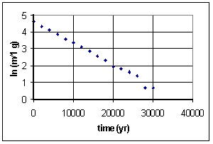
Since we know carbon-14 is an isotope which undergoes radioactive decay, we guess that this function is an exponential decay. To see if that works, we take the natural log of values on the vertical axis, that is ln (m/1 g). We divide m by 1 g because the argument of a ln function must be dimensionless. This is the graph we get:
A guardian angel must be helping, because this is (aside from one stray data point) a straight line of intercept approximately 4.6 and slope -1.3x10⁻⁴. So y = mx + b transforms intoln m = -(1.3x10⁻⁴)t + 4.6 which can itself be transformed by raising each side by exponent e:e(ln m) = e-(1.3x10⁻⁴)t+4.6 orm = (e4.6)e-(1.3x10⁻⁴)t The half-life is defined as th = (ln 2)/k, where k is the constant in the argument of the exponential. In this case, k = 1.3x10⁻⁴, som = 99.5e-(1.3x10⁻⁴)t
th = (ln 2)/(1.3x10-4) = 5300 years which is not far from the published value of 5730 years, especially considering that our teachers used the same early 21st century high school lab equipment for 30,000 years to make measurements.
It is also worth noting that in particle physics, instead of half-life, the characteristic decay time is the lifetime tL where tL = 1/k. By this measure, the lifetime of our carbon-14 "particle" istL = 1/(1.3x10-4) = 7700 years. The half-life is the time for 1/2 of a sample to decay; the lifetime is the time for 1/e of a sample to decay.
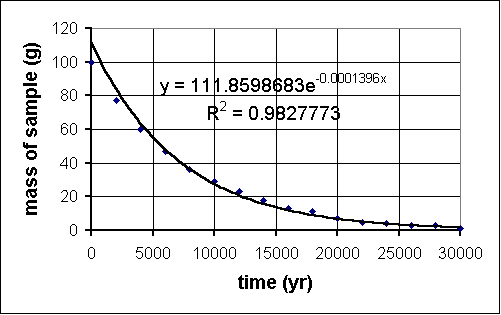
Another aside: many of these datasets lend themselves to analysis using the trendline feature on MS Excel. To do this, you must:
and away you go. The R2 value is the correlation coefficient. It is a statistical measure of the fit of your trendline function to the data. The closer this number is to 1, the better. Here is the result when we applied this to our carbon-14 experiment:
- Make a scatter plot of the data.
- Click on a data point; a task menu will pop up.
- Go to "Add Trendline" on the menu.
- Click on a likely choice for function type.
- Do NOT click "OK" yet; rather, click the "Options" tab near the top.
- Click the checkboxes for "Display equation on chart" and "Display R-squared value on chart."
- NOW click "OK."
Would you like to try some problems on your own? Proceed!
| Example 3 | Problems |

