|
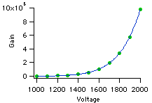
After looking at possible relationships between our original gain vs. voltage data, we decided a power relationship, shown at the left, best described our data. A power relationship is given by: |
|
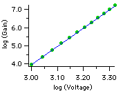
We then took the log of our measured values of gain and voltage and plotted log (Gain) vs. log (Voltage). From our power relationship, this is equivalent to saying: Using a rule of logarithms, we can rewrite this equation as: Using another rule of logarithms, we can rewrite this again as: This is equivalent to: |
|
|
Look carefully at our logarithmic plot. Notice that log (Gain) is plotted on the y-axis, and log (Voltage) is plotted on the x-axis. We can now rewrite our equation as: a and b are constants, so b*log(a) is just a constant--let's call it k. This is simply an equation of a line. In fact, it's the equation of the blue line plotted on our logarithmic plot!
|
|