Getting to Higgs
Making a Histogram - An Example
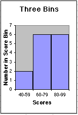
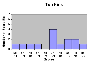
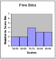
| The teacher grades the tests and creates bins of width 10 points: . . . , 30-39, 40-49, 50-59, 60-69, 70-79, . . . . The number of test scores in each data bin is recorded and plotted as a bar graph. | |||||||||||||||||||||||||||||||||
|
Miss Chang's Physics class has just taken a test. In order to come up with meaningful grades, Miss Chang will make a histogram to represent the distribution of grades and find a reasonable central value.
The critical question is that of bin size. Clearly, a bin size of 100 makes no sense as it puts all the data in one bin, giving us no information. At the same time, a bin size of 1 or less makes no sense, as the bins would be so small as to look pretty much like a simple list of results. We already have that! Let's try a few bin sizes:
To more easily see how the size of the bin affects the shape of the curve, try the dynamic histogram. | ||||||||||||||||||||||||||||||||
|
|
|
|
Assignments: Identifying B - Identifying W |